Herewith a report on a fairly-typical week of Google Analytics numbers. I was going to work this into the regular weekly statistics report, but I’m not at all sure I’m going to go on running analytics, so as a separate post this will remain available either way. [Update on screen sizes.]
GA is pretty easy to install, just a bit of javascript. General impressions are, well... it’s OK. It has an implicit 1999-flavored view of the Web, assuming that you care a lot about “stickiness”, i.e. it’s a good thing to attract people to your site and a bad thing when they leave it. (Uh, why would you have links then?)
Anyhow, the graphs are kind of pretty. Here’s the overview, which you’ll need to blow up to full size to see effectively.
The Story in the Numbers · Let’s think about these four graphs one by one. 
The raw visits numbers seem plausible to me; the “Beyond Java” pieces I published early in the week drew a pretty steady flow of visitors which fed on itself as the days went by, then a vicious attack piece by Andrew Orlowski (I tend to share his disdain for the “Web 2.0” marketechture, but anything that touches on blogging predictably drives him into spiteful gibbering) sent lots more visitors on Friday. Saturday was unusually quiet, everyone out shopping I guess.
On the other hand, the lower-right graph is pretty good evidence that GA under-counts blog readers. The two slices labeled “direct” and “bloglines.com” (together, a little over 30% of visitors) are probably almost all readers arriving via a subscription feed. Just over 60% of the articles here have only one paragraph and thus are completely there even in the RSS feed; so, that 30% of visits is the people who saw one of those multi-paragraph pieces in their RSS feed and actually cared enough to click through to ongoing to read it. So how many more feed-only or feed-mostly readers are there out there? Nobody knows.
The “Geo Map Overlay” is kinda pretty I guess, but doesn’t really tell you much that’s surprising.
There are two things here that seem wrong. First of all, the claim in the top-right graph that 70% of the people visiting the site are first-timers? I’m not measuring that myself, but it’s really, really hard to believe. GA has been running for several weeks now, so it should have picked up the regulars.
Also, in the bottom right, you can’t see it on this graph, but on some days and weeks, there’s a separate little “Google Images” slice. My own numbers show more visitors from there than from Google itself; so I went back and checked carefully, and I’m pretty sure I’m right and GA is wrong. I assume they’re mistakenly regarding some Google-Images searches as plain Google. I do plan a careful comparison, one of these days, of GA’s top-referer numbers with my own, since this is one of the few areas where I’m pretty sure I’m right.
So I reported that as a bug, but the reporting process had that familiar Google “we’re-too-busy-being-scalable-to-hear-you” tone.
Next, let’s look at their article tracking:
This shows that they’ve got a few internationalization kinks to work out; but also that over half my readership comes neither from the front page nor from the current week’s pieces; these would be the people coming in from search engines or via links to popular old pieces.
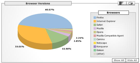
Next, browser versions.
This is wildly inconsistent with my own numbers; I see a much higher proportion of visitors using IE. It’s possible, as some have suggested, that I’m being fooled by the huge numbers of scrapers and robots and idiot-ware that claim to be IE. I do try to program around that, but maybe I’m missing things. Still, I tend to suspicion on this one.
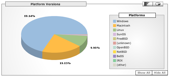
Here’s the graph of operating systems.
I’ve never tried to measure this myself, but find this picture pretty believable. Anyone disagree?
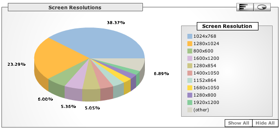
Finally, here’s something I’ve always wondered about: are the 800x600 screens now finally mostly behind us? The answer would seem to be “Yes”. [Update: Rudi Gens writes to point out that the multipurpose handheld devices that people carry around are just getting up into the 320×240 range; so maybe the small-screen problem will be back with a vengeance.]
The Future · I think I’ll be more apt to use this now and again as a sanity check, as opposed to running it continuously. There really truly is a privacy issue here; running this gives our big-G friends a whole lot of information and while I’m not convinced they’ll mis-use it, I’m also not convinced they won’t. And at the end of the day, my hand-crafted tools tell me most of what I need to know. Except, of course, how many people read ongoing via subscription feeds; and nobody seems to have a handle on that problem. 
December 04, 2005
· Technology (90 fragments)
· · Publishing (161 more)
· Business (126 fragments)
· · Internet (113 more)
· Technology (90 fragments)
· · Publishing (161 more)
· Business (126 fragments)
· · Internet (113 more)


