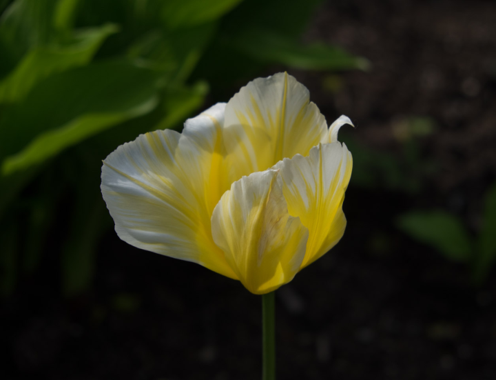
One of the nifty features of the Fujifilm X cameras is a set of filters that try to capture the color flavors of their famous film products from days of yore: Astia, Provia, Velvia, and so on. But this is for JPEGs and I shoot raw, so I’d pretty well ignored them. Recently, the filters got added to Adobe Lightroom, so I thought I’d try them out.
[Disclosure: Back in the film days I shot Kodachrome, mostly.]
Here’s our subject, a graceful tulip in Vancouver’s Queen Elizabeth Park. This rendition is what you get by default when Lightroom sucks in Fuji raw files, called “Adobe Standard”.
The named-film renditions are “Provia” (Officially: PROVIA/STANDARD), the default that Fuji uses when they’re generating the JPEGs, “Velvia” (Velvia/VIVID) — I never used it but remember photogs waxing nostalgic — and “Astia” (ASTIA/SOFT). Then there are two labeled “Pro Neg. Hi” and “Pro Neg. Std”; I have no idea what that means. Finally, there are four monochrome treatments: basic MONOCHROME and three color-filtered, labeled “MONOCHROME+Ye FILTER”, “MONOCHROME+R FILTER”, and “MONOCHROME+G FILTER”.
I included all of these versions here in the first draft of this blog piece but the differences are sometimes subtle and didn’t leap at the eye when the pictures were laid out in a row. So instead, I made a little Fujifilm treatment switcher where you can switch them back and forth.
Which do you prefer?
Disclosure: Most of the Fujifilm treatments had more contrast and dropped the tulip stem right into darkness. So all the renditions except for the one you see above have the stem bumped up a bit to keep it visible.

Comment feed for ongoing:
From: Eric A. Meyer (May 07 2014, at 14:06)
I preferred “Velvia/VIVID” in this case, because it brought out the tulip’s inner illumination the most and that’s exactly my groove spot. I love pictures that reveal what I call “secret light”, and with the Velvia filter, that’s what I got.
[link]
From: Michael (May 07 2014, at 15:31)
I liked the Pro Neg Soft, mostly because it brought out more details in the yellows. Some of the other renditions blew out the highlights in the yellows, although that could be the result of a poorly calibrated monitor.
[link]
From: ebenezer (May 07 2014, at 19:21)
Monochrome is great (though perhaps less than ideal in the case of this particular subject).
[link]
From: hpc (May 08 2014, at 01:24)
Strangely in BW+G the leaves seem has darker than in the BW+R.
[link]
From: Robert Sayre (May 09 2014, at 18:40)
The pro treatments are probably supposed to be Fujicolor 160NS (portrait) and Fujicolor 160C (high contrast).
160NS was a big hit at the time.
[link]
From: Bud Ryerson (May 11 2014, at 18:53)
Mono +R
[link]